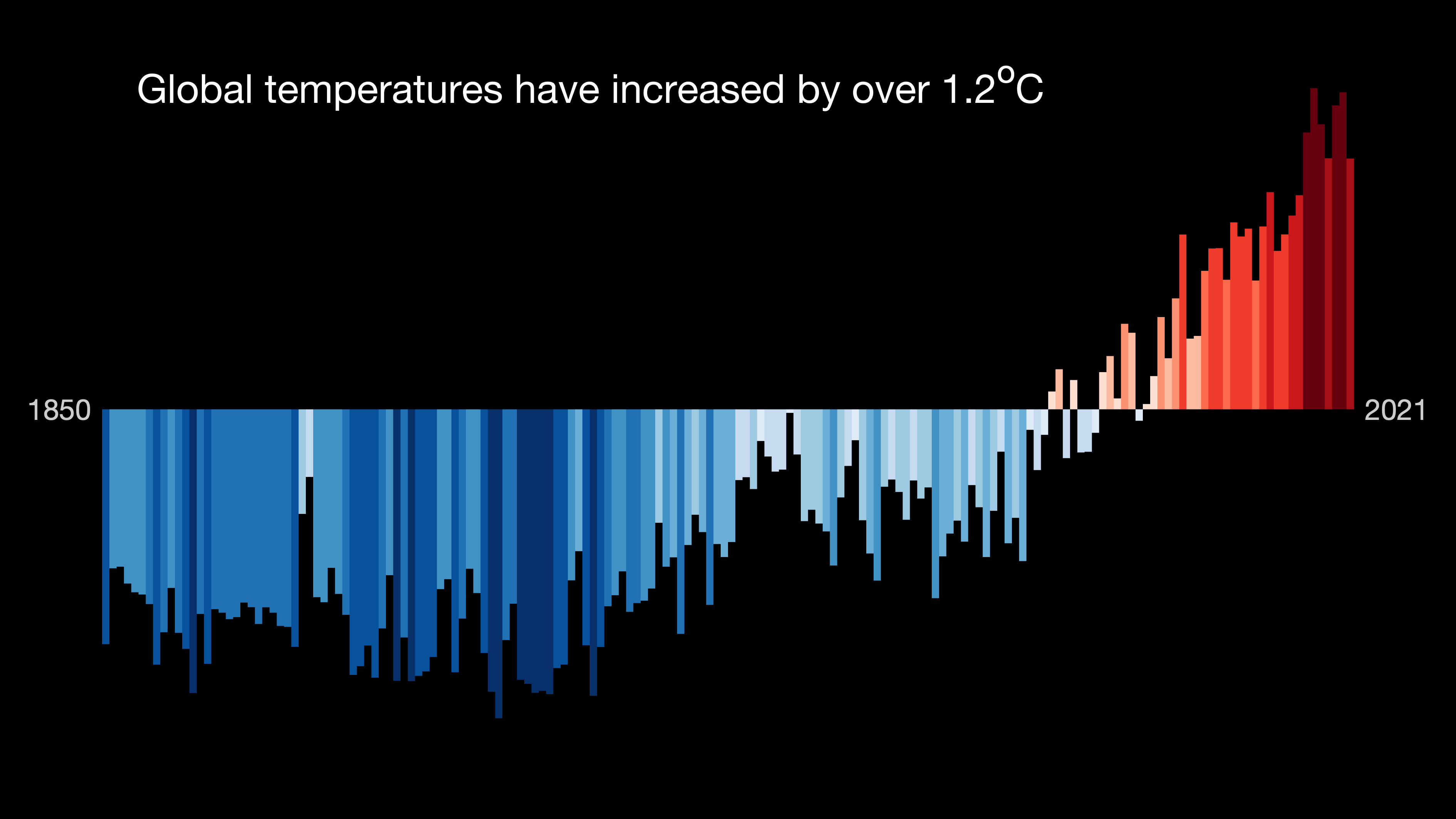
Warming Stripes (2022)
climatechangeisms.substack.com
Warming Stripes (2022)
An Ekphrastic Climate Poem by Adam Powers


WARMING STRIPES (2022)

            Everything now feels one-directional, but
in general, it used to feel all sorts of blue—
            arctic, robin’s egg, frosted, cerulean.
Spells of bluebells, periods of azure.
    They felt foam pools in-between sky-blues
       pouring into every evening, swimming into midnights, shiny wet jewels of blue.
          Seems sapphire-like. Beautiful. As if, everything was cool…

                                                                                      you may have felt the misty rose,
              the partly cloudy blues. I can almost feel the pale dot blues—
                                                      but I’ve never lived a blue day in a year below average.
                                             I’ve only ever seen sanguine, heated-cream, quartz, maroon,
                                       felt the rage warm through ruby, oxblood, cardinal, and crimson:
                                                                              flaring fossil-fueled code-reds for all living.
— Adam Powers
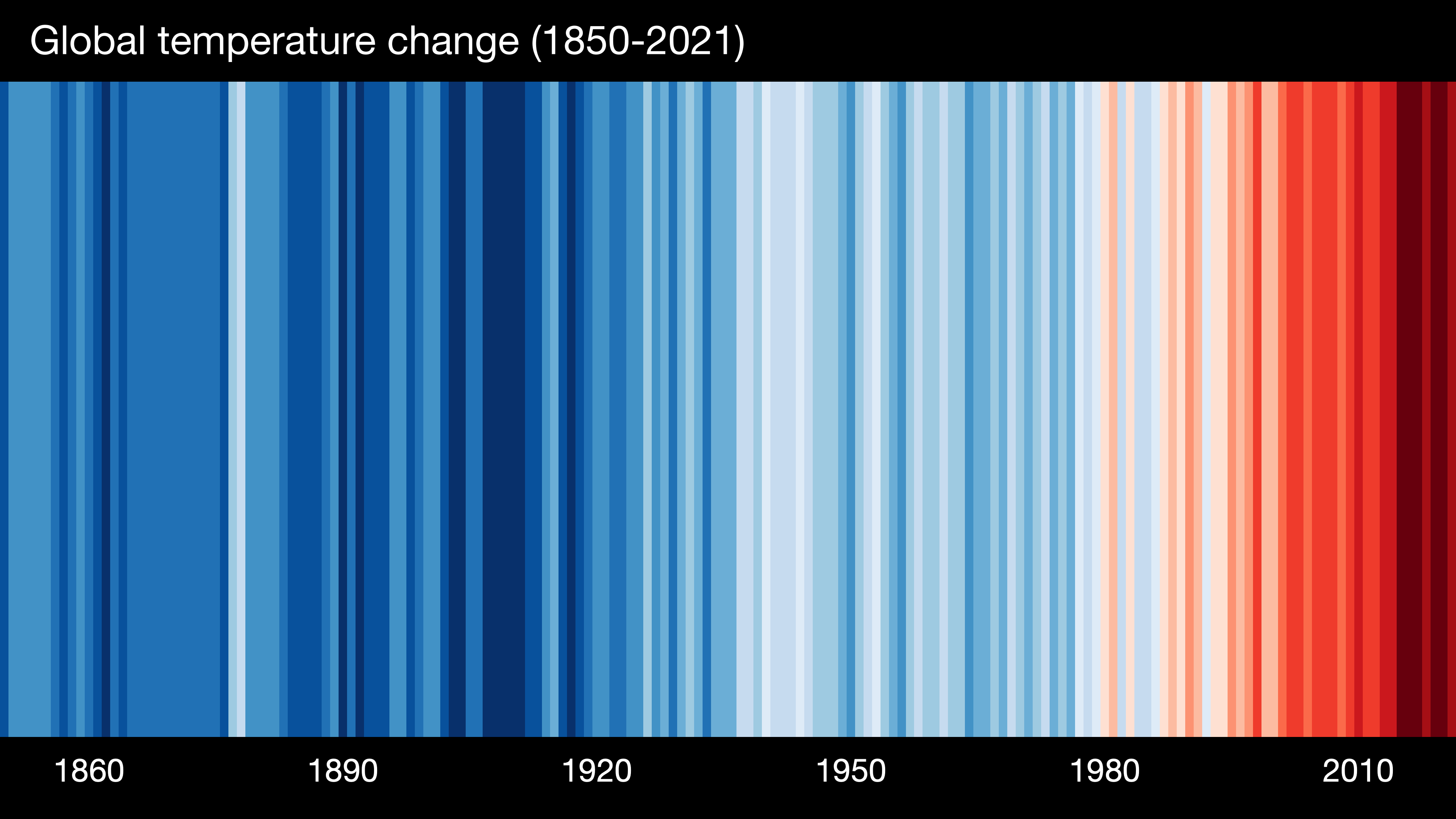
For your most up-to-date warming stripe graphics including 2022 data, go here:
https://showyourstripes.info/
https://www.climatecentral.org/climate-matters/showyourstripes-day-2023

Warming Stripes graphics represent the change in temperature over the last 100+ years. Each stripe represents one year, and the color corresponds to temperature. Red stripes are years above a long-term average temperature and blue stripes are years below. — ClimateCentral